Bootstrap Grid Structure
• Hello everyone! Our topic is, how to use Bootstrap Grid System in our web page. Before we start, let me first introduce you what is Bootstrap and how we can implement it in our webpage. • Bootstrap: Bootstrap is the best HTML, CSS and JavaScript framework for any web developer. It will help you to quickly produce responsive, mobile friendly and clean looking websites. It does this simply by providing you with tons of pre-built CSS and JavaScript for lists, navigation bars, forms and lots of other web elements. It provides different view on different screen size. Example –

(Fig1 – Different view of web pages on different screen using Bootstrap)
• How to implement or download Bootstrap: You can easily implement Bootstrap by adding the given line of code into <head > tag of your html file. Example: Insert this yellow code into head tag like given in figure 2.
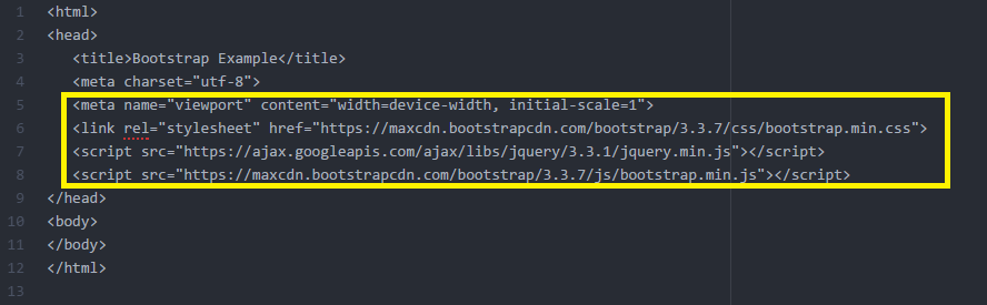
You can get this code from the official link of bootstrap from here.
Introduction of Grid Structure:
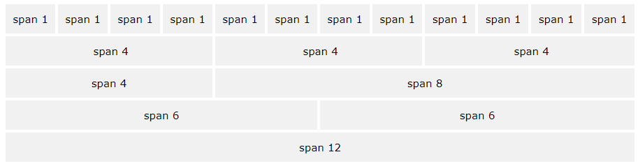
• Bootstrap grid system provides quick and easy way to create responsive website layouts. • Bootstrap's grid system allows up to 12 columns across the page. • If you do not want to use all 12 columns individually, you can group the columns together to create wider columns. • Example:
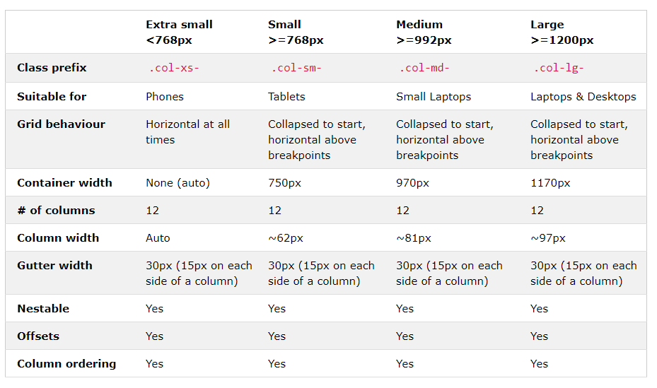
• Bootstrap's grid system is responsive, and the columns re-arrange depending on the screen size: On a big screen it might look better with the content organized in three columns, but on a small screen it would be better if the content items were stacked on top of each other. • There are four classes for Grid Structure. • Grid Classes: i. xs (for phones - screens less than 768px wide). ii. sm (for tablets – screens equal to or greater than 768px wide). iii. md (for small laptops- screens equal to or greater than 992px wide). iv. lg (for laptops and desktops – screens equal to or greater than 1200px wide).
Grid System Rules
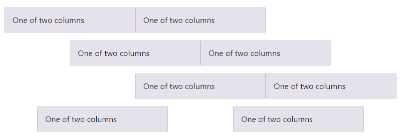
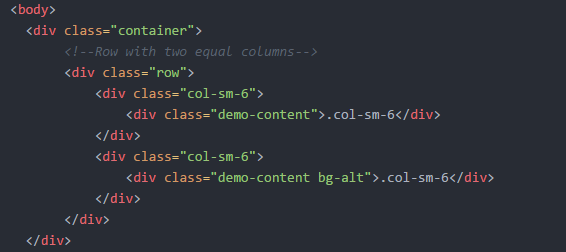
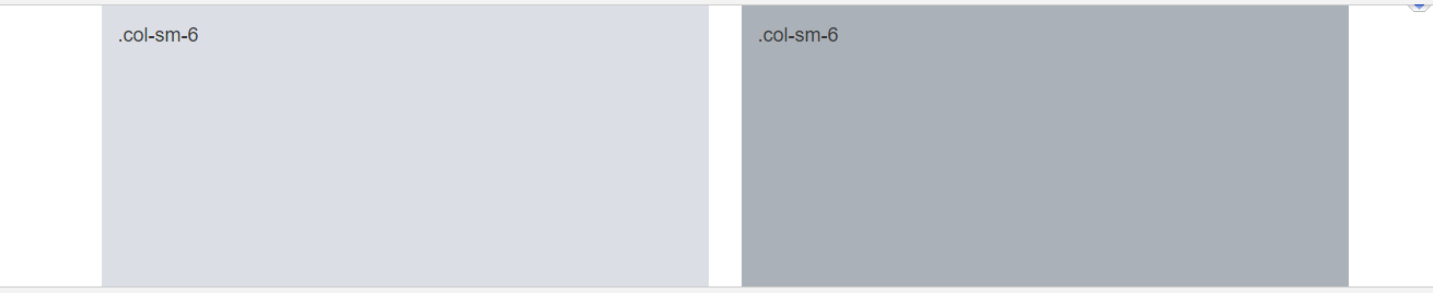
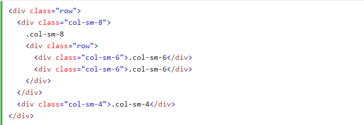
Some Bootstrap grid system rules: • Rows must be placed within a .container (fixed-width) or .container-fluid (full-width) for proper alignment and padding. • Use rows to create horizontal groups of columns. • Content should be placed within columns, and only columns can be immediate children of rows. • Predefined classes like .row and .col-sm-4 are available for quickly making grid layouts. • Columns create gutters (gaps between column content) via padding. That padding is offset in rows for the first and last column via negative margin on .rows • Grid columns are created by specifying the number of 12 available columns you wish to span. For example, three equal columns would use three .col-sm-4 • Column widths are in percentage, so they are always fluid and sized relative to their parent element. • Now let us take a simple example of only 2 columns.
The output of following code is
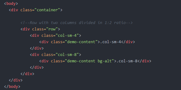
The following example shows a simple "stacked-to-horizontal" two-column layout, meaning it will result in a 50%-50% split on all screens, except for extra small screens, which it will automatically stack (100%). • If we want to change the ratio of columns width, we can change the class declaration. For example to make the column of ratio 1:2 we can modified our code as follows -
The output of the code column in ratio 1:2 is
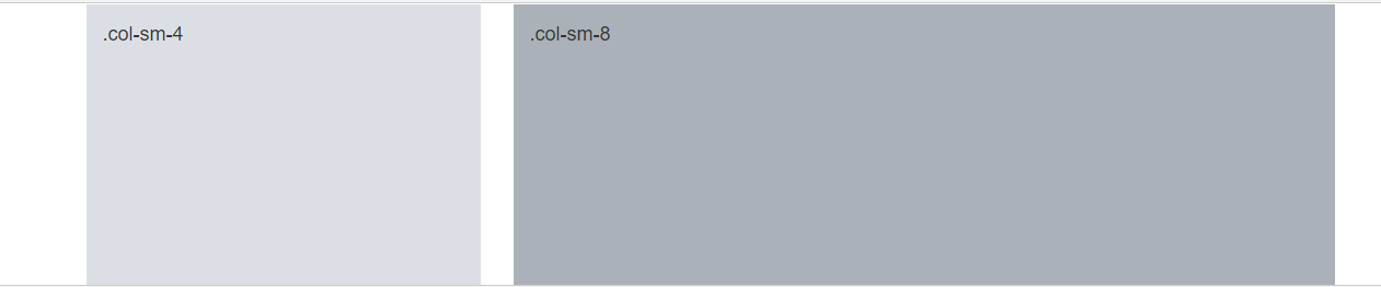
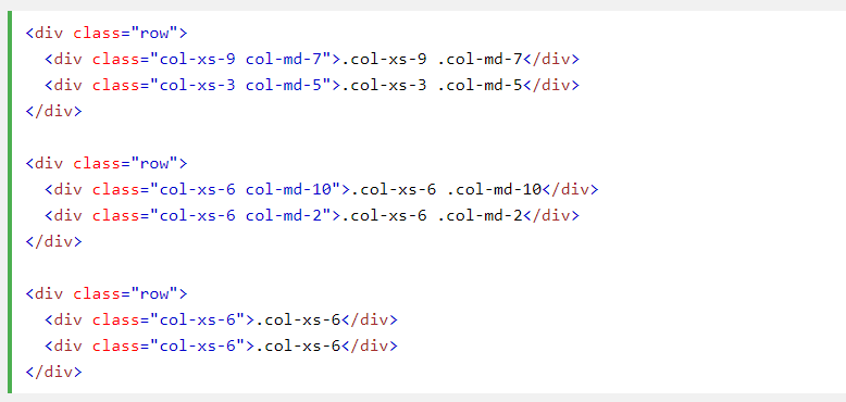
• Since Bootstrap grid system is based on 12 columns, so to keep the columns in a one line (i.e. side by side), the sum of the grid column numbers in each row should be equal to 12. If you see the above example carefully you will find the numbers of grid columns (i.e. col-sm-*) add up to twelve (6+6, 4+8 and 3+9) for every row.
Grid Options
The following table summarizes how the Bootstrap grid system works across multiple devices:
Creating Multi-Column Layouts with Bootstrap Grid
The following example shows how to get two columns starting at tablets and scaling to large desktops, with another two columns (equal widths) within the larger column (at mobile phones, these columns and their nested columns will stack)
Mixed: Mobile and Desktop
The Bootstrap grid system has four classes: xs (phones), sm (tablets), md (desktops), and lg (larger desktops). The classes can be combined to create more dynamic and flexible layouts. NOTE: Each class scales up, so if you wish to set the same widths for xs and sm, you only need to specify xs.
• This code provides different view on different screen sizes.
Alignment in multiple Grid
1. Vertical Alignment
1. Vertical Alignment
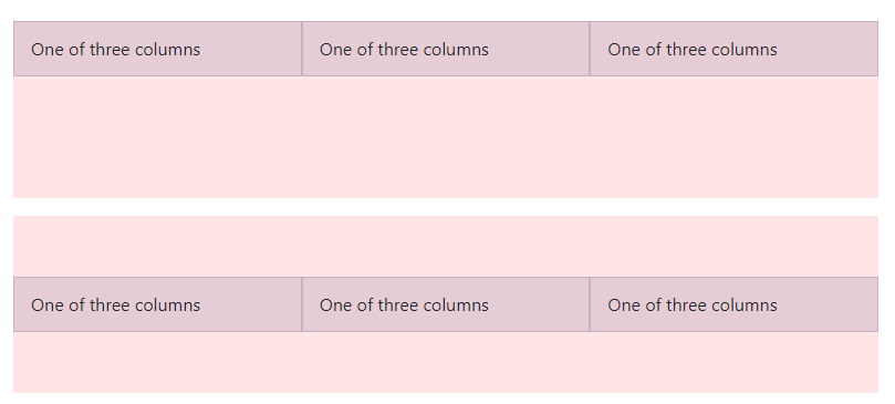
• Use flexbox alignment utilities to vertically and horizontally align columns. • Example:
(fig 1-A)
• we can align our column by the help of following code-
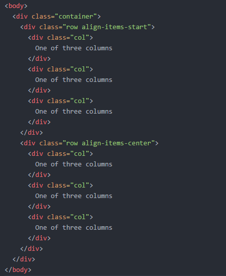
• In the above code when we declare the class as row align-items-center it can vertically align a column in center. As given in fig 1-A.
2. Horizontal alignment
We also align the column horizontally by declaring the class- • < div class="row justify-content-start" > for align column in left. • < div class="row justify-content-center" > for align column in centre. • < div class="row justify-content-end" > for align column in right. • < div class="row justify-content-around" >.
View as shown in figure-